
The Dublin SEO Company #1 SEO Agency In Ireland
The Dublin SEO Company is one of the top SEO companies in Dublin. Whether you are an in-house SEO expert searching for an SEO agency in Dublin, or you own or manage an SEO company in Dublin that is looking for SEO reseller services to support SEO projects, contact our team today!
An SEO Agency in Dublin That Guarantees To Take Irish Businesses To New Levels!
Guaranteeing results in search engines like Google sounds crazy, right? You are probably thinking something along the lines of “How can an SEO company in Dublin offer Pay on Performance SEO services?!” There is a simple answer to this question: we are an SEO agency that can pre-qualify your ability to rank in Google and follow the Three Pillars of Search Engine Optimisation to ensure success.
Why Choose Us Above Other SEO Agencies in Dublin?
The Dublin SEO Company is operated by a team of SEO experts with almost two decades of hands-on experience delivering SEO strategies worldwide, and that is hard to find! We have managed successful SEO services in Dublin and beyond for 1,000+ SEO campaigns covering every niche you can imagine and targeting various geographically targeted audiences.
We’re An SEO Company In Dublin Using The Three Pillars of SEO
Delivering our clients successful search engine optimisation services is only achievable if our team covers the core “three pillars of SEO“. Dublin has numerous SEO companies offering organic digital marketing services with promises of taking over the world but sadly delivering nothing but empty promises, and this is where our specialist Dublin SEO team significantly differs from our peers = we pre-qualify all projects so we can provide Pay on Performance SEO services that adhere to the Three Pillars of SEO which we have explained below in detail:
1. Technical SEO Audit
At its core, the organic search engine optimisation process is either launched with the initial focus on the solid structural integrity needed for successful SEO strategy or (sadly) is already destined to fail due to SEO audits delivered by agencies lacking knowledge of the technical foundations required to perform on the first page of search engine result pages (SERPs).
Some of the areas covered in technical SEO audits compiled by Dublin SEO agencies give detailed SEO tasks, such as the following snapshots taken from our technical SEO audit:
Site Technology And Website Architecture Auditing

Website Relevancy Review

Google Search Console + Google Analytics Audits & Action Plan

2. Content Relevancy: SEO Experts Make You Stand Out As The Best Website In Your Niche

There is no question about the need to invest in your content, and you will not succeed unless you strive to be the most relevant and obvious standout page content relevancy and quality. Areas that must be covered include (but are not limited to):
- Target keywords being relevant to your target audience
- Search intent to internet users related to your content
- Search volume to ensure an increase in organic traffic once search rankings appear on the first page
- Structured data opportunities used to the full
- Usability and conversion optimisation focused
- And more (and yes, having the best content marketing on-page strategy does improve your Google Ads quality score!)
No SEO agency in Dublin should be taken seriously without suggested improvement for content relevancy, and it is simply impossible to rank without it! Search engines rank web pages in top positions on the first page because they deserve it, and online business marketing to drive organic traffic has a talent requirement in any SEO team that is of significantly high priority.
3. Authority Building With High-Quality Backlinks
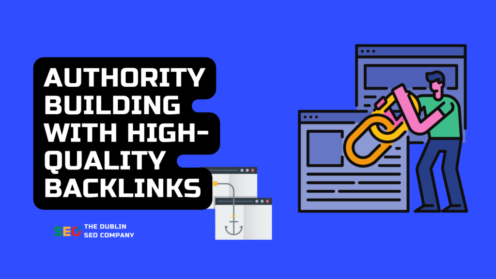
No SEO agency in Dublin is performing without focusing on high-quality backlinks being built to promote the relevance (SEO Content) we generate during pillar 2. SEO progress dries up without the hard work being done to generate authoritative and relevant backlinks, with the primary objective of generating more overall external backlink authority than the top-ranking competitors for your target keyword groups.
Link-Building Strategies Boost SEO Solutions in 2024
The link building services an SEO agency needs to have in its war chest must be highly diversified and can include such tactics as:
- Guest posting as a regular contributor on niche-specific blogs gives your authorship more credibility in your space, along with the benefits of guest posting sites potentially referring traffic relevant to your target audience and the highly desired benefit of passing authority to your website via links from your contributions.
- Blogger outreach to find quick win content marketing placements on niche relevant websites looking for content gaps to be filled and possibly even needing relevant content to point a link to within existing blog material (aka Niche Edit).
- Press release submissions to ensure the latest internal news and updates may be picked up by journalists writing for local and national news sites
- Social profile building uses stacking techniques to harvest maximum external link authority from the web’s highest authority domains which are long-term and stable link assets.
- Niche forum contributions are a great way to not only create fast, relevant high-quality backlinks to your content but also garner greater readership from relevant users seeking local businesses like yours.
- Local and niche directory link building is another solid area to focus efforts on, but with the focus being on quality over quantity, consistency of your NAP (name, address, and phone number), and the overall quality of each potential placement in search results. These can influence your local search engine optimisation and Google business profile in the three-pack listings.
- And many more – any solid internet marketing strategy that generates long-term organic traffic cannot rely on only 1-2 tactics to survive. Digital marketing agencies offering organic search engine optimisation to their clients must have an exhaustive list of proven link building tactics to deliver results.
Affordable SEO Services In Dublin
Any SEO budget for Dublin SEO services needs to be built around the return on investment from that SEO budget. Firstly it’s important to understand what you are covered for in your SEO report transparency so you get why high quality search engine optimisation services are not ‘cheap’.
Small Business SEO Services in Dublin Starting at €500/Month
Are you looking for the leading SEO Services Dublin businesses can trust to provide the skills and experience needed to deliver the best SEO results? Our SEO experts cover everything you need to rank your business at the top in Google Maps, Organic Search Results, Google three pack, and many more search engine optimisation wins for lead-generation for businesses, such as:
- Google Business Profile Optimisation
- SEO Technical Set Up & Optimisation
- SEO Content Writing Services & Strategy
- Link Building
Pay On Performance SEO Services: Pricing POA
Our Pay on Performance SEO Agency services allows you to sit in the driving seat confident that everything will be taken care of, which is excellent if this is your first time in an SEO venture.
- Google Business Profile Optimisation
- SEO Technical Set Up & Optimisation
- Local & National SEO Content Writing Services & Strategy
- Aggressive High-Quality Link Building
Monthly SEO Dublin & Ireland-Wide: Pricing from €1,000/Month To €10,000+/Month
- Google Business Profile Single OR Multi-Location Management
- Technical Search Engine Optimisation Strategies
- Single OR Multi-Location SEO Content Writing Strategy
- Aggressive Link Building To Acquire High Quality Backlinks